FUNKO
Lifestyle Ads
One benefit of working with other creatives is discovering ways to collaborate that can make big improvements to each other's work, and maybe even the company itself, with little to no increase in cost and very little extra effort. When I started at Funko, the photography team were already creating beautiful lifestyle imagery. But, outside of social posts, and a series of photo books, this work was largely unknown by the world outside. Their work brought personality and individuality to a product that, when only encountered on the shelves of big box retailers, often looked ubiquitous and interchangeable. While the hard core fans saw this work, the more casual collector did not.
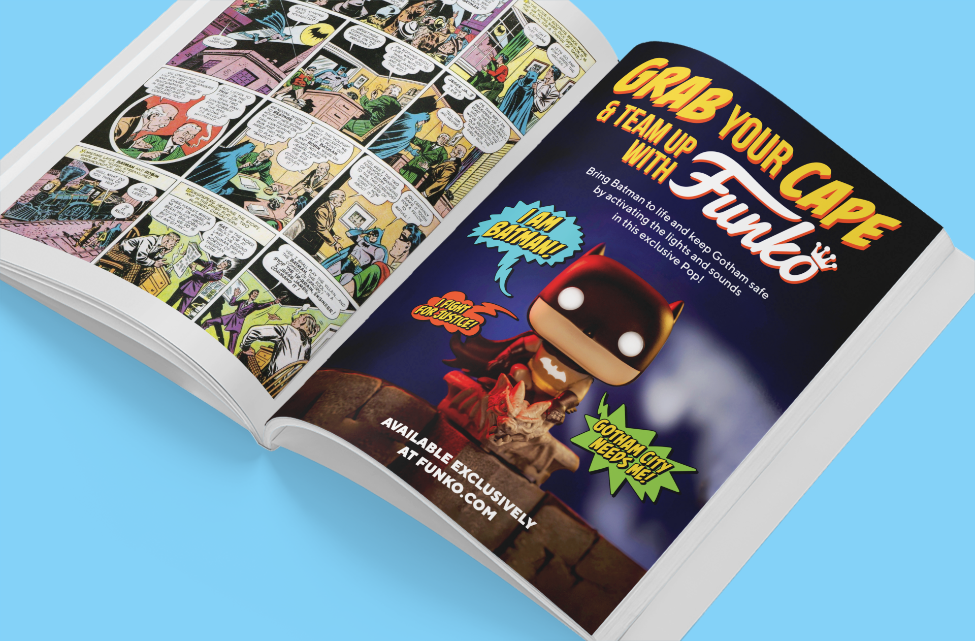
Beginning with this ad for Funko's Sound Effects Batman, I wanted our audience to see a different side of Funko. Instead of using the usual "glam" assets (glams are the low contrast illustrations you see on Pop! packaging), which brought the uniformness of the big box experience to our creative work, I wanted to use our evocative photography in a way that showed customers just how fun and engaging our products (and the creative behind them) really were. Something to make them want to reach out and play with those figures. I designed the layout, typography and even illustrated the word balloons. I collaborated with Ashley Brock to find the right photo and Meridia Clark, who wrote the copy. Our art director, Kayla Mogensen, oversaw the whole thing, offering crucial feedback to dial everything in under a tight deadline. It was a thrilling example of team collaboration and one of my favorite creative experiences at Funko.
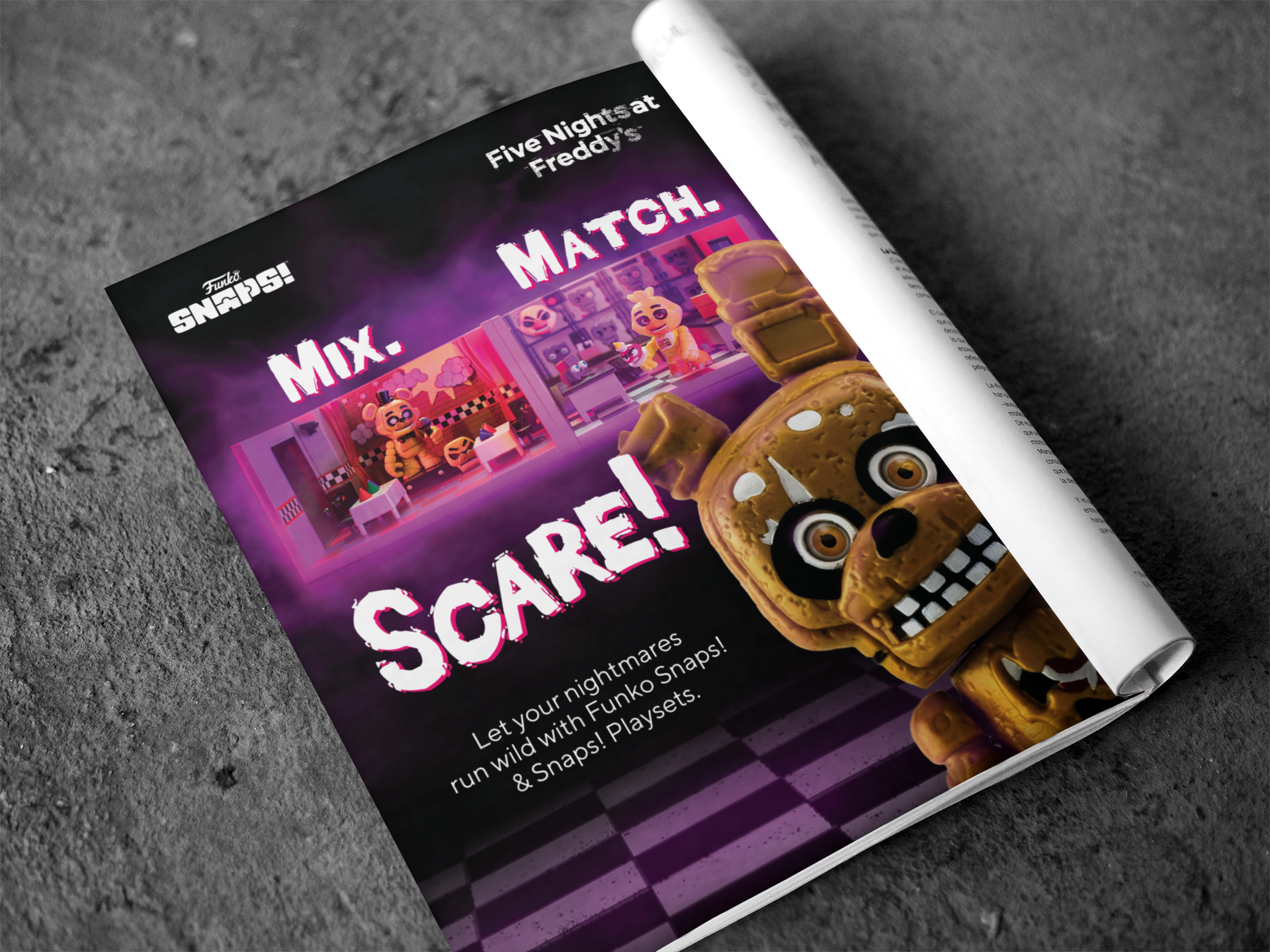
For another print ad, this time for Five Nights at Freddy’s SNAPS!, I again had access to some beautiful photography from Ashley Brock. This time I was able to composite a few different playsets that Ashley had photographed with some ghostly pink fog, which I was able to digitally extend. To bring in the thrill of the game, I had Springtrap (that creepy Bunny thing) in the extreme foreground to mimic the jump scares the game is so famous for.
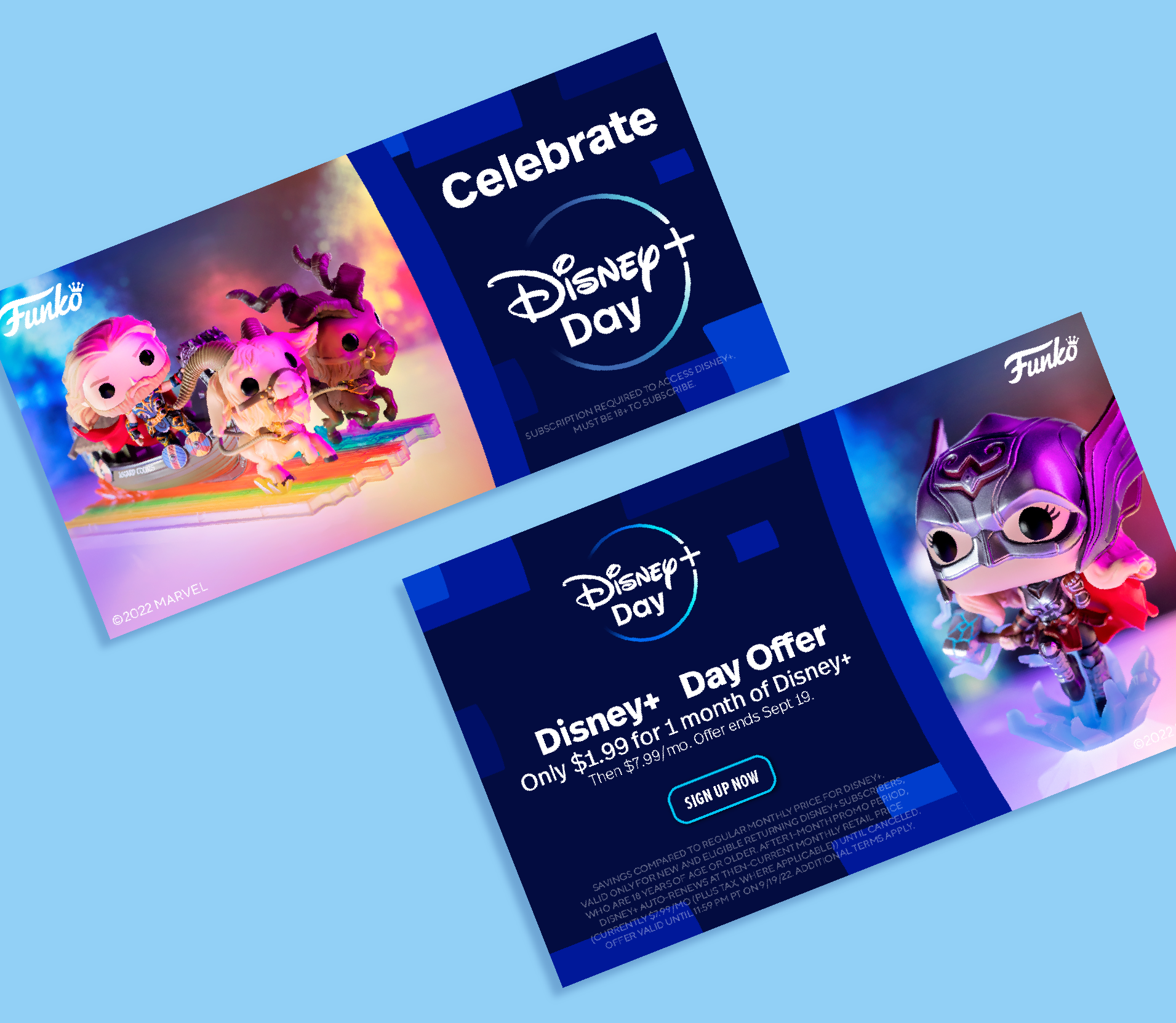
This one seems a little more straight forward but it's actually pretty crazy. While I had access to the Disney Plus brand guide and logo, there were no other assets for this campaign. I actually had to create all of the remaining Disney Plus design elements from scratch using the specs and examples from their brand guide. Since just about every company that licenses from Disney also participates in the Disney Plus campaign, I was able to research what our competition did to make sure ours stood out from the crowd. In the end they were not only on brand, but also sharp and eye catching, thanks in no small part to Chelsea Bradley’s beautiful and colorful photography for Funko’s Love and Thunder line.
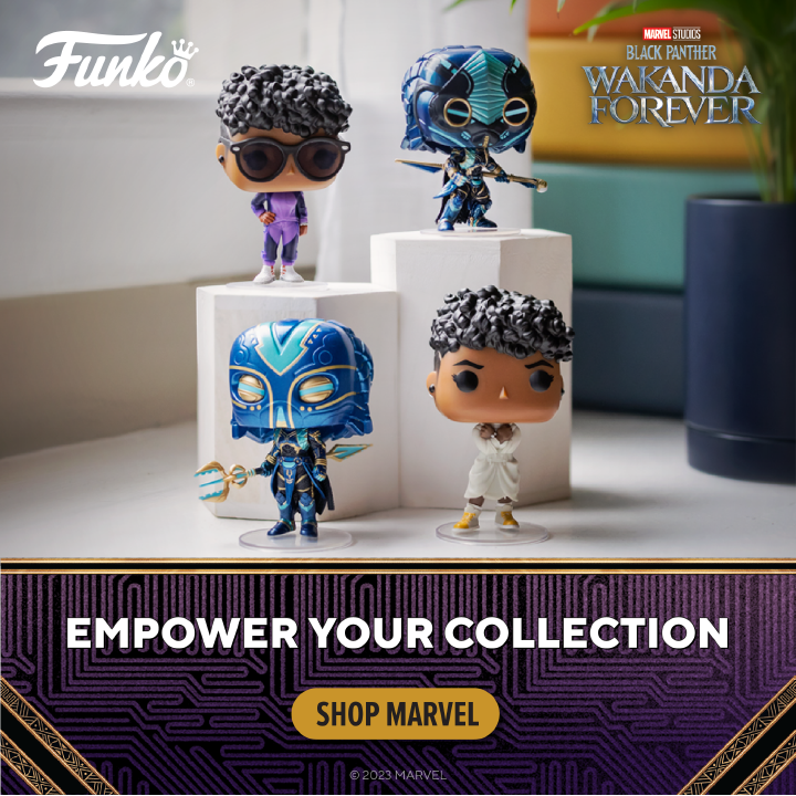
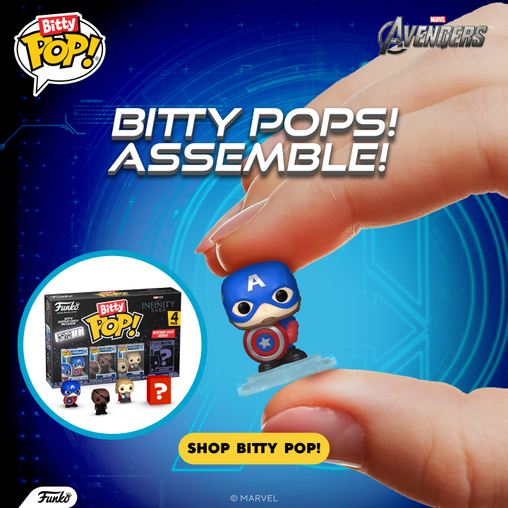
Only a few months later, Funko pivoted to incorporating lifestyle photography into all marketing campaigns whenever possible, as you can see above.
While I can't claim all the credit for that pivot, it does make me feel warm and cozy to believe that my work and internal advocacy played a part in demonstrating exactly how powerful lifestyle photography and design can be together as well as how we were able to make our creative more effective without upping costs.