FUNKO
Website Design
While I was at Funko, I had the opportunity to help with the redesign of the website. The UX team and stakeholders had come up with a template they were happy with, but the challenge that remained was how to represent all the brands that might appear in an A+ page. Like a mini-landing page within the site, the A+ pages would sometimes include a single brand (see the DC example below), but in other cases (as in the Animation example below) would encompass a multitude of brands that needed a singular visual identity.
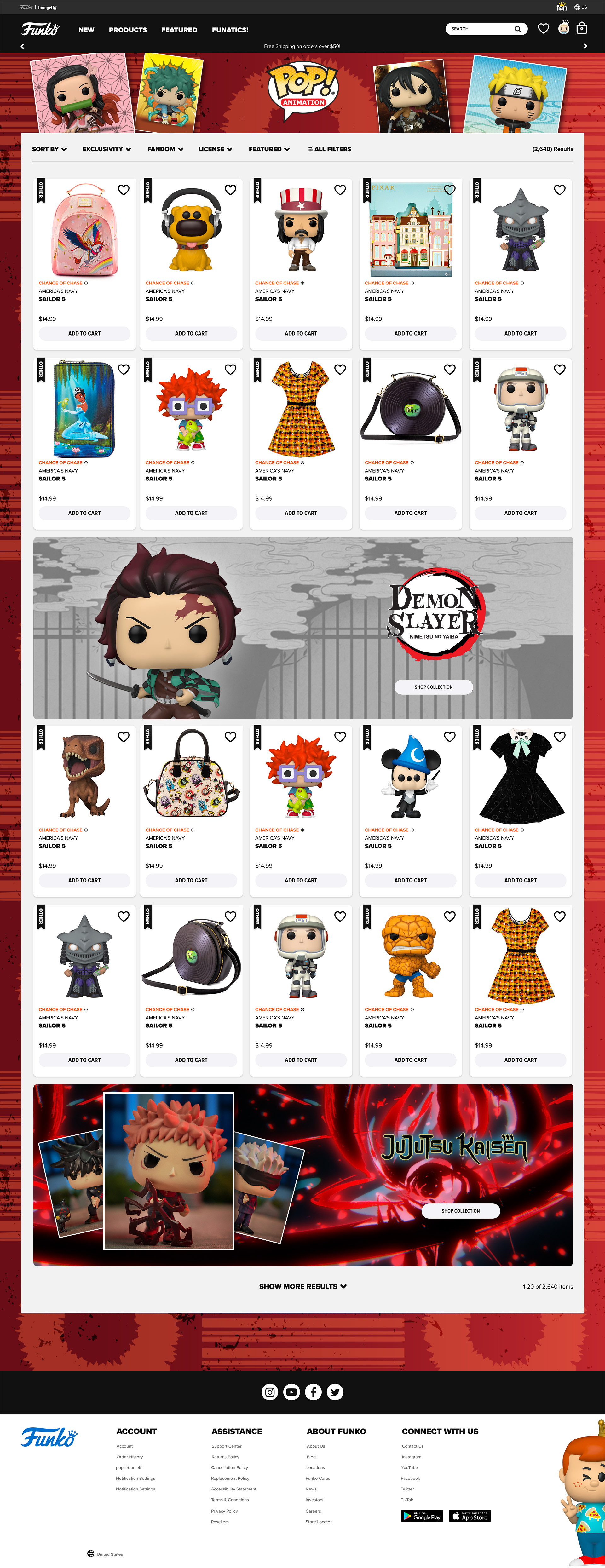
The animation category is mostly a catch all for Anime. And as any anime fan knows, that medium covers an endless array of brands and genres. To try and encapsulate them all, I looked to an energy burst and speed-lines as basis of a repeating pattern that would capture the vitality of the medium. In addition, I designed the two product features (Demon Slayer and Jujutsu Kaisen) that needed to follow their own brand guidelines within the broad identity.
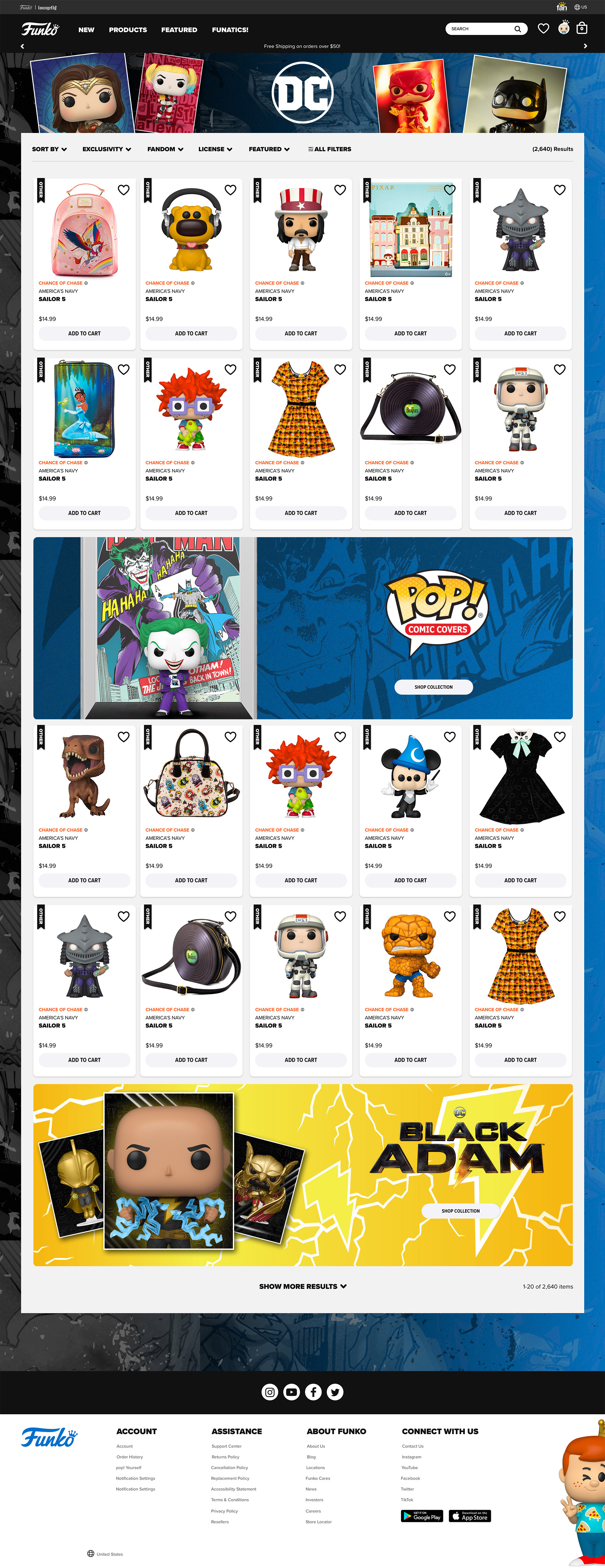
Likewise, for DC I sourced and created a paneled collage that could be used to suggest the breadth of their beloved characters. Again, I built the features for Pop! Comic Covers and Black Adam to complement the identity as a whole.
A+ Anime Page Design Work Highlighted
A+ DC Page Design Work Highlighted